How to stop Claude Code from building generic AI‑looking websites
Updated 11 November 2026
Claude Code builds the “AI look” because, with no design rules, it falls back on the most common patterns it has seen: cards everywhere, soft gradients, glowing shapes, large radii and an icon on every line. You stop it by giving it a short, checkable design system before it writes any code, and by asking it to review each change against that system.
Why every AI-built site ends up looking the same
A model asked for “a modern landing page” picks the safest answer: the average of thousands of SaaS pages. Without a brief, it has no reason to choose a typeface, a grid or a single accent colour, so it chooses all the defaults at once. The result is anonymous, and a client paying for a studio site notices.
A better prompt for each page will not fix it: prompts are forgotten between sessions. Rules written in a file at the root of the project are read every time, and Claude Code loads project instructions automatically (see how Claude Code reads memory files).
9 rules that keep the AI look out
Put these in a DESIGN.md file and import it from CLAUDE.md with a line @DESIGN.md (Claude Code), or reference it from AGENTS.md for other agents. Each rule is written so that it can be checked, not interpreted.
- One type scale, written as numbers. For example 14, 16, 20, 28, 40, 64. No size outside the list.
- Two typefaces at most, with the weights allowed for each. Name them; don’t settle for “a modern sans”.
- One accent colour, used only for actions and the current state. Everything else is ink, paper and greys.
- No cards unless the content is a list of equal items. Text and images sit on the page, aligned to the grid.
- No gradients, no glows, no shadow deeper than 1 px. If something needs to stand out, use size, weight or space.
- Two corner radii: one for buttons and fields, one for media. Nothing else is rounded.
- Icons only where a word would be slower to read. Never one icon per bullet.
- Spacing on one scale (for example multiples of 8 px), with the gap between sections written down.
- Every new section reuses an existing component. Any exception is listed and justified.
Make Claude review its own changes
Rules only work if they are applied. End every task with the same request: “Review your diff against DESIGN.md and list each rule you broke, with the line.” Because each rule is a number, a name or a yes/no question, the model can check it. Vague rules such as “keep it clean” cannot be checked, so they tend to be ignored.
Two habits help on client work:
- Keep the design tokens (colours, sizes, spacing) in one CSS file and forbid raw values elsewhere. A hex code in a component is a rule break you can search for.
- Look at the page at 390 px wide after each change. Generic layouts often survive on desktop and fall apart on a phone.
Start from a design that already has a point of view
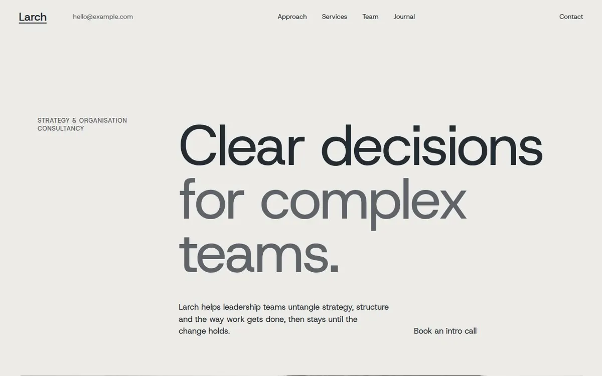
Rules stop the drift, but they do not create a direction. The fastest way to get one is to start from a site a designer already drew, with its type, grid and colours decided, and let Claude adapt the content. That is what an Oddhand template is: a client site in a real trade (architecture studio, health practice, software startup, consulting firm, developer tool, AI product), sold as a Framer remix, an AI kit (DESIGN.md, AGENTS.md, tokens.css), or both. Each template shows which versions are on sale.
See the templates and their live demos
Questions
Does this work with Cursor, Lovable or v0 too?
Yes. The rules are plain text. Cursor reads project rules, and Lovable or v0 accept them pasted at the start of a project. What matters is that each rule can be checked.
Should I write the DESIGN.md myself?
Write the decisions yourself: typefaces, colours, scale. Claude can format them, but if it chooses them, you are back to the defaults.
Will a template still look like a template?
Only if it is used as is. Swap the content, photos and accent for the client, keep the grid and the type scale, and the site reads as designed, not generated.
More guides
- Can I use one Framer template for several client sites?
What the default Framer Marketplace licence allows, what an extended licence adds, and what to check before reusing a template for client work.